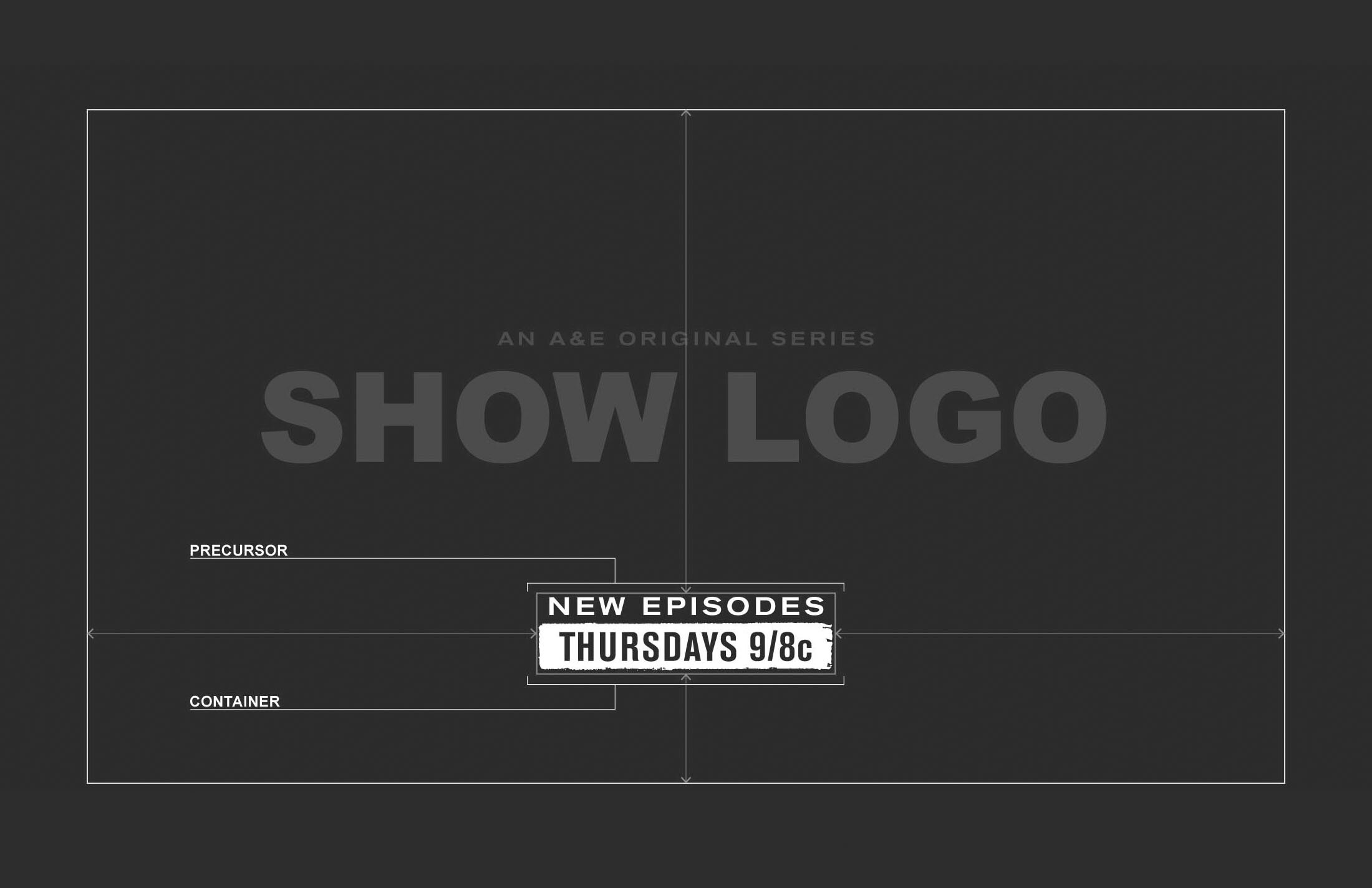
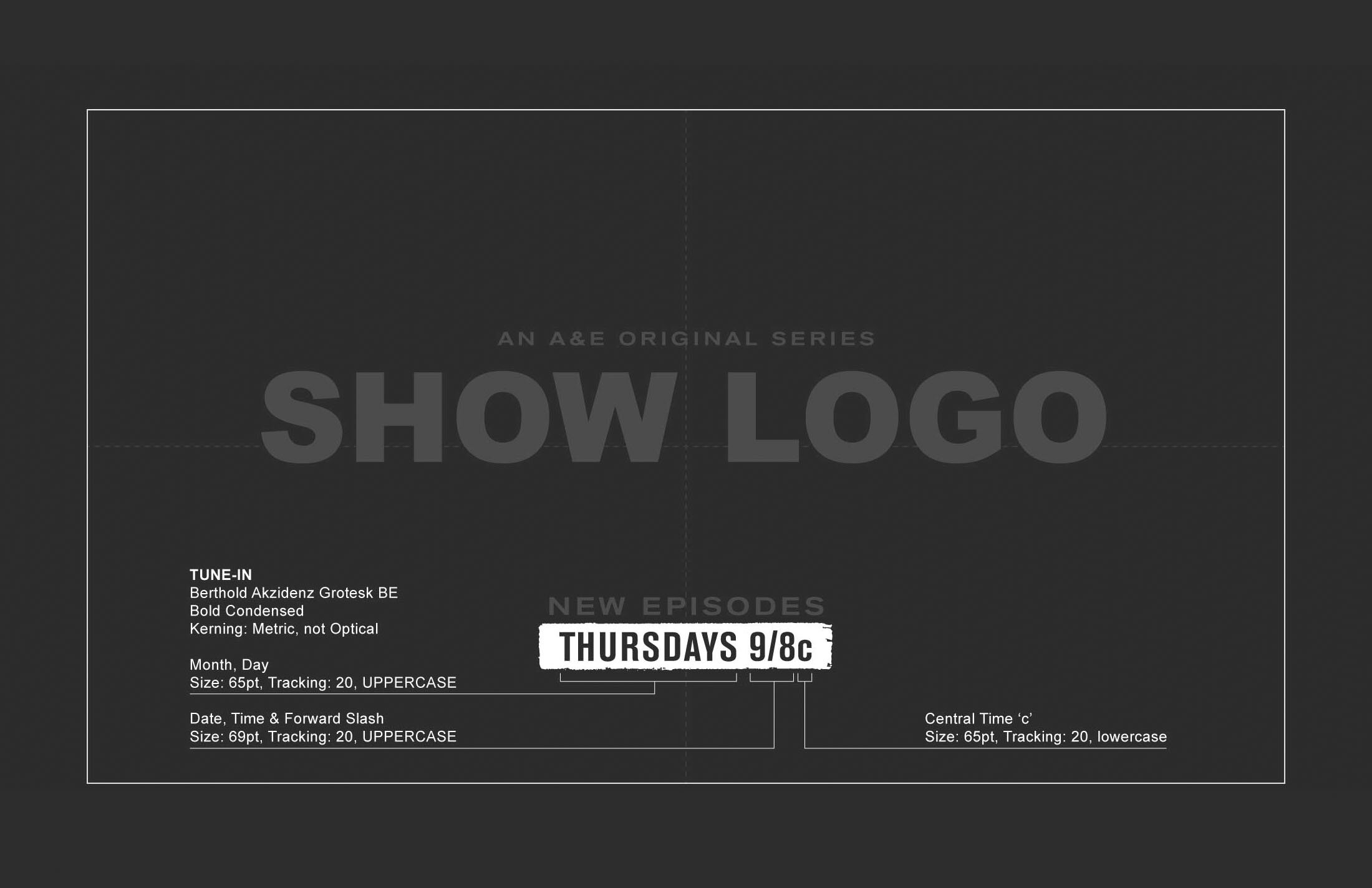
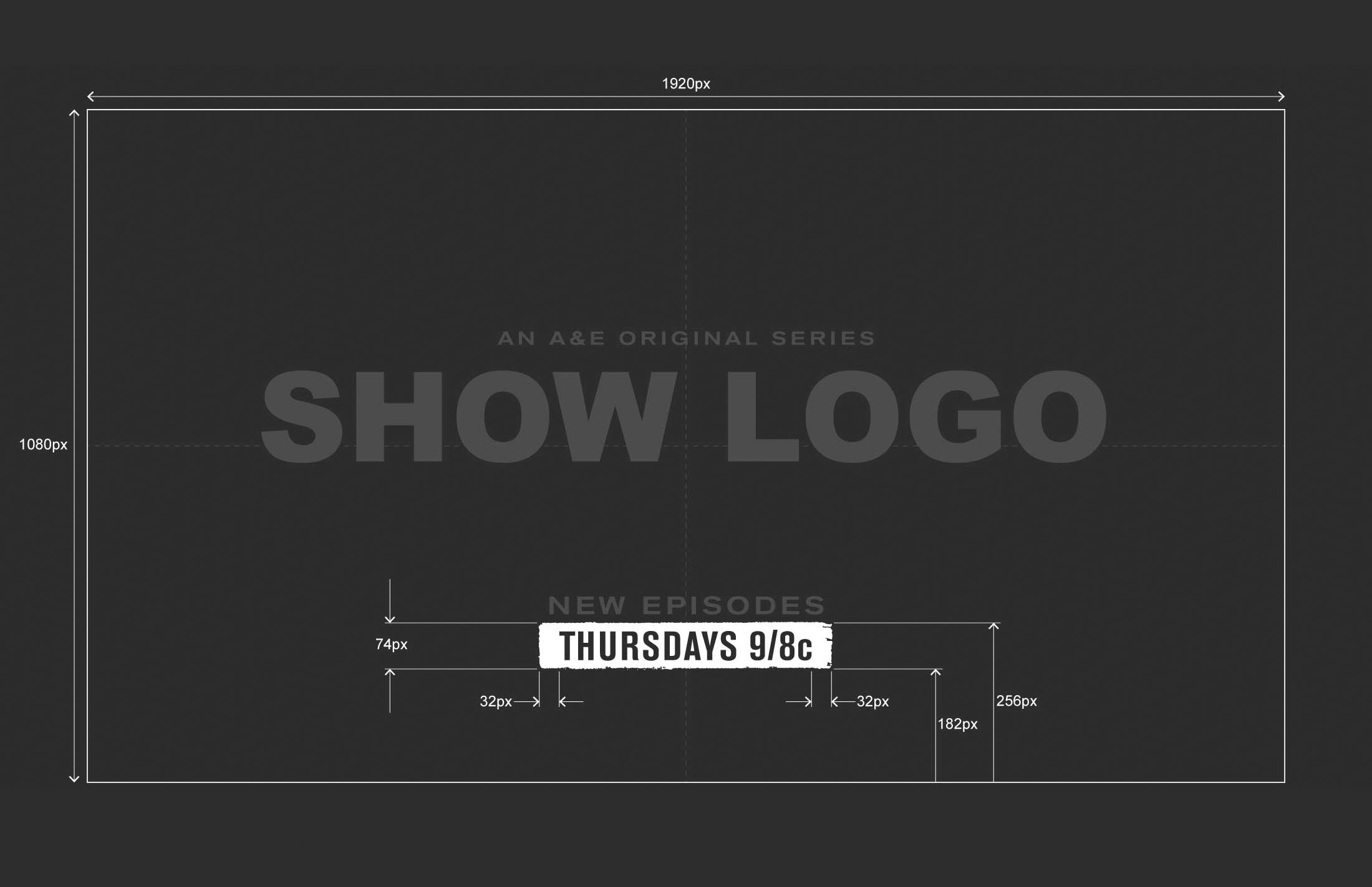
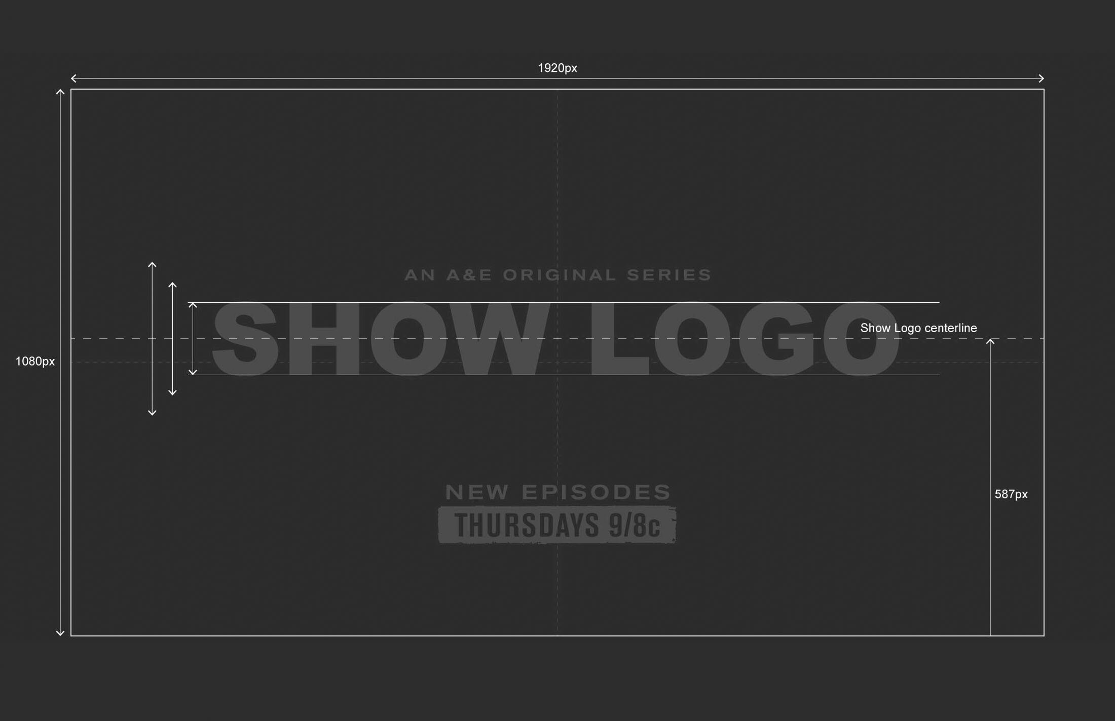
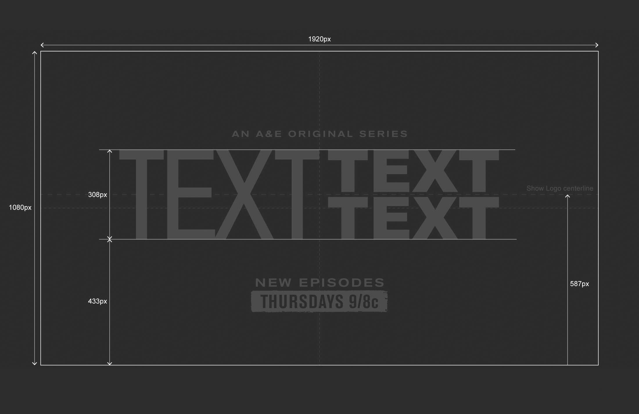
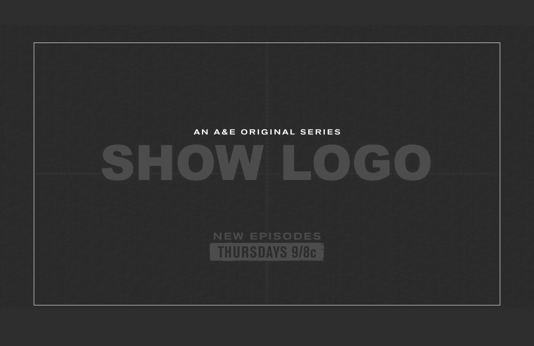
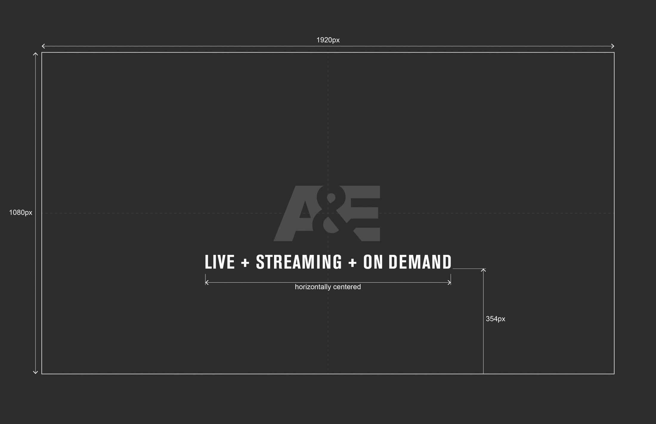
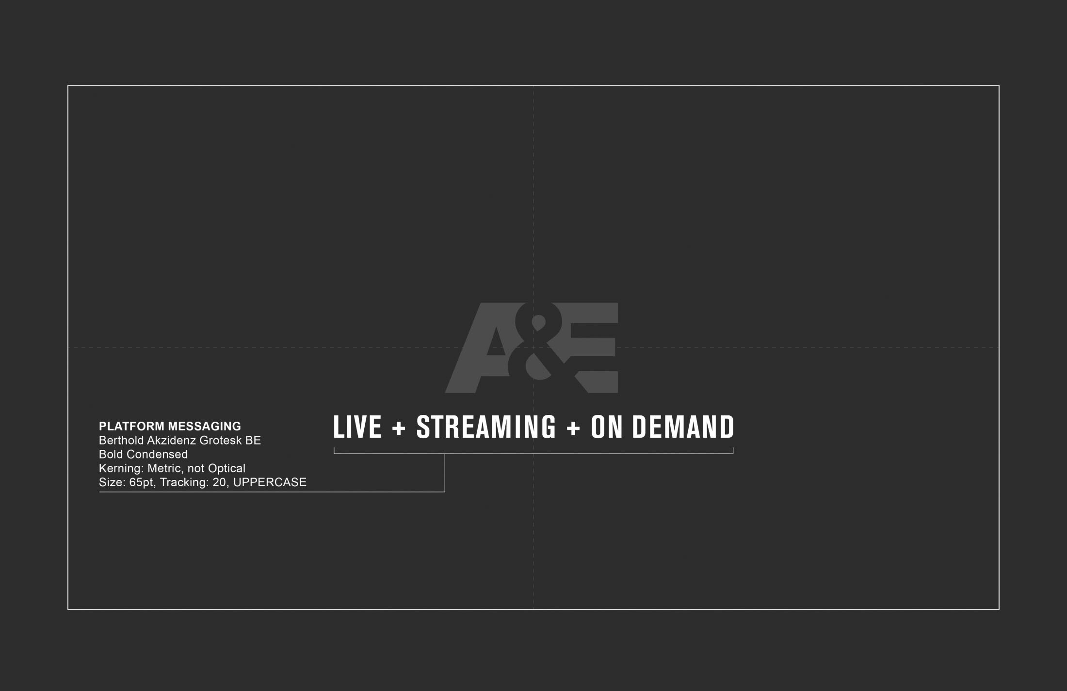
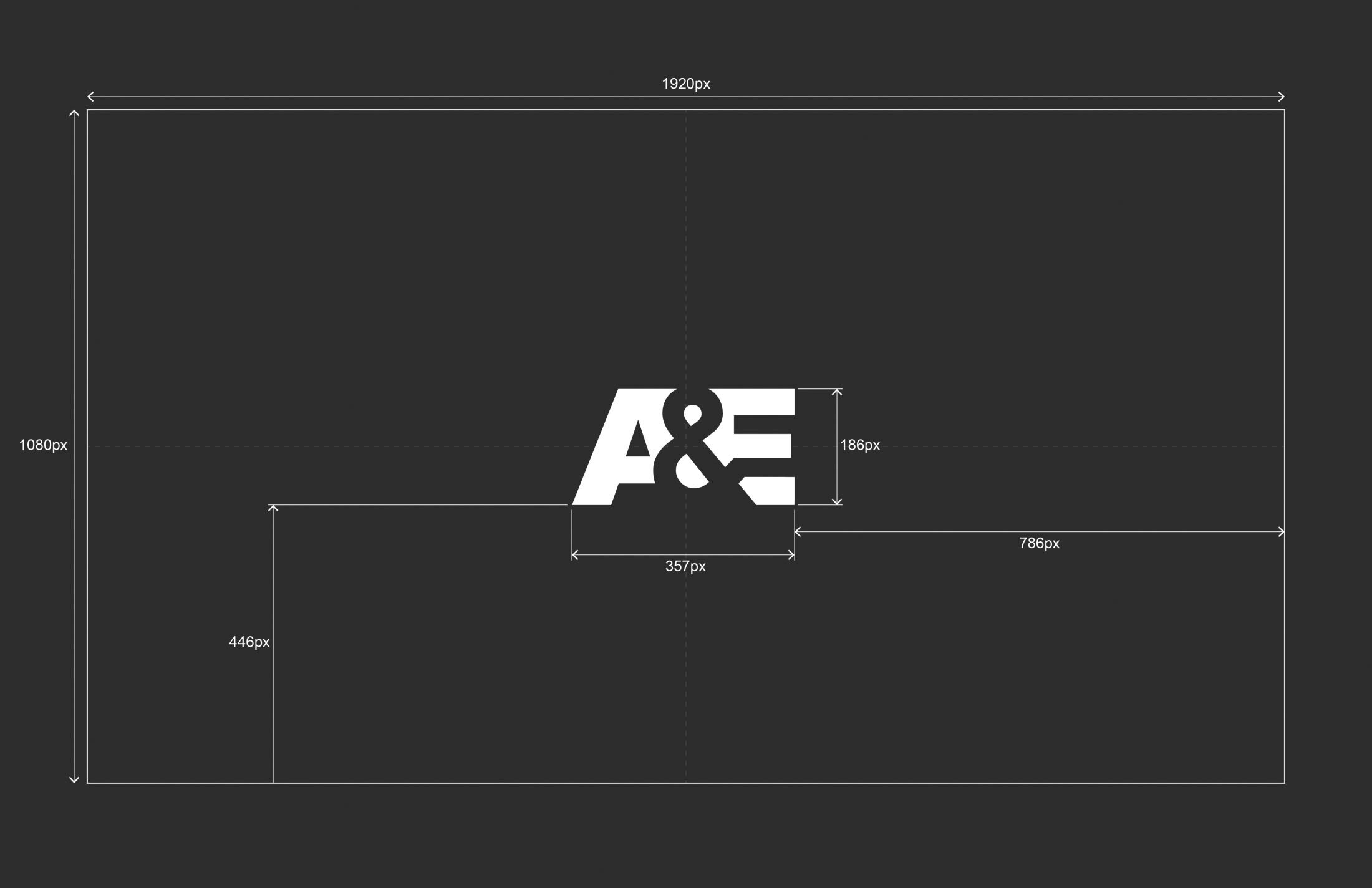
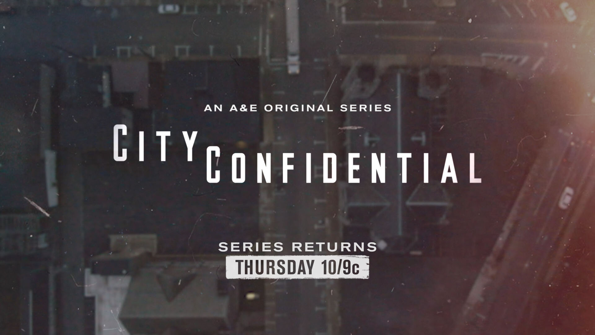
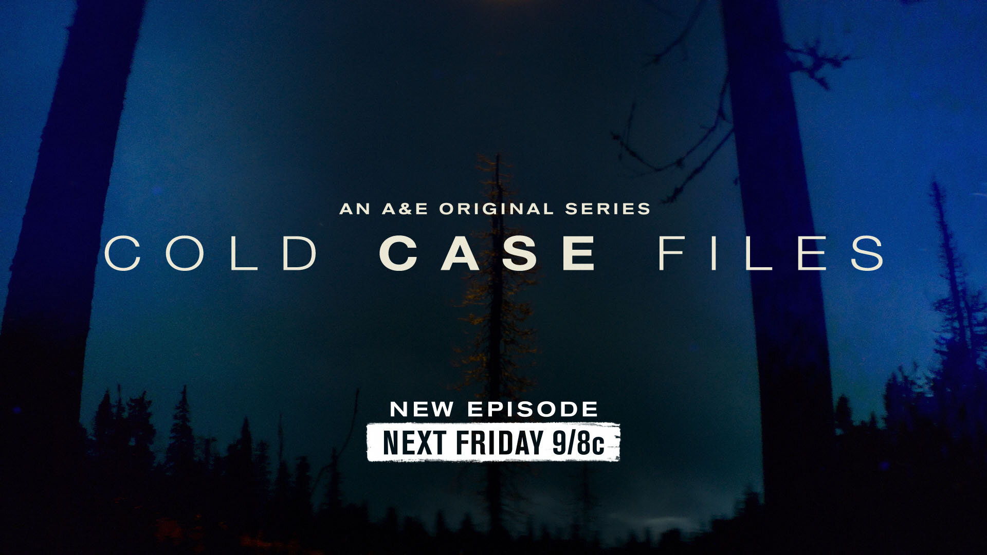
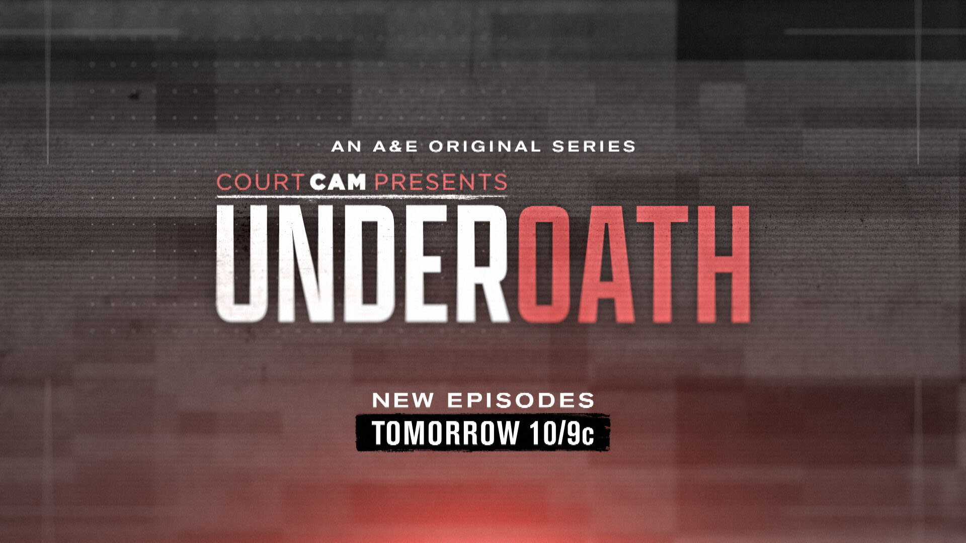
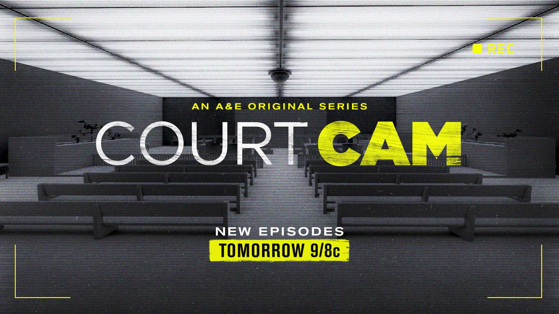
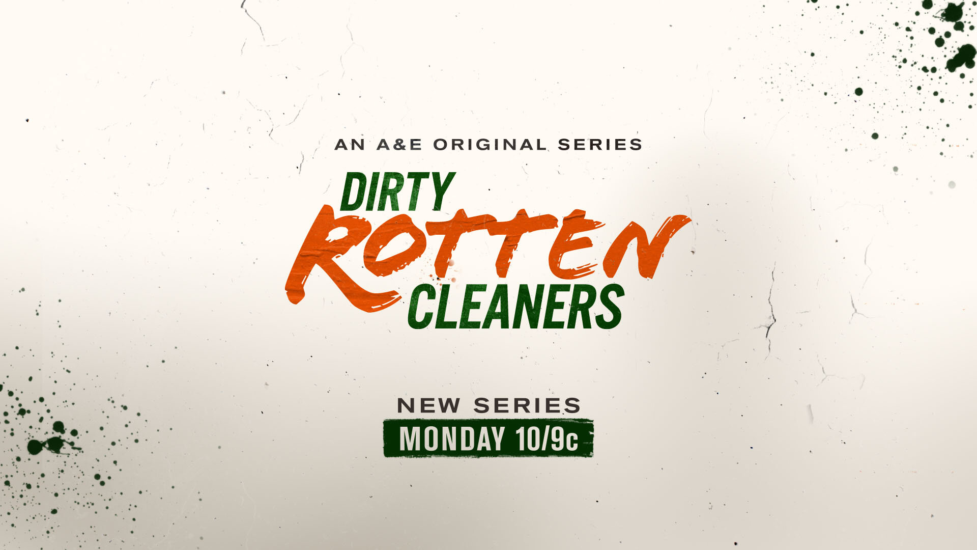
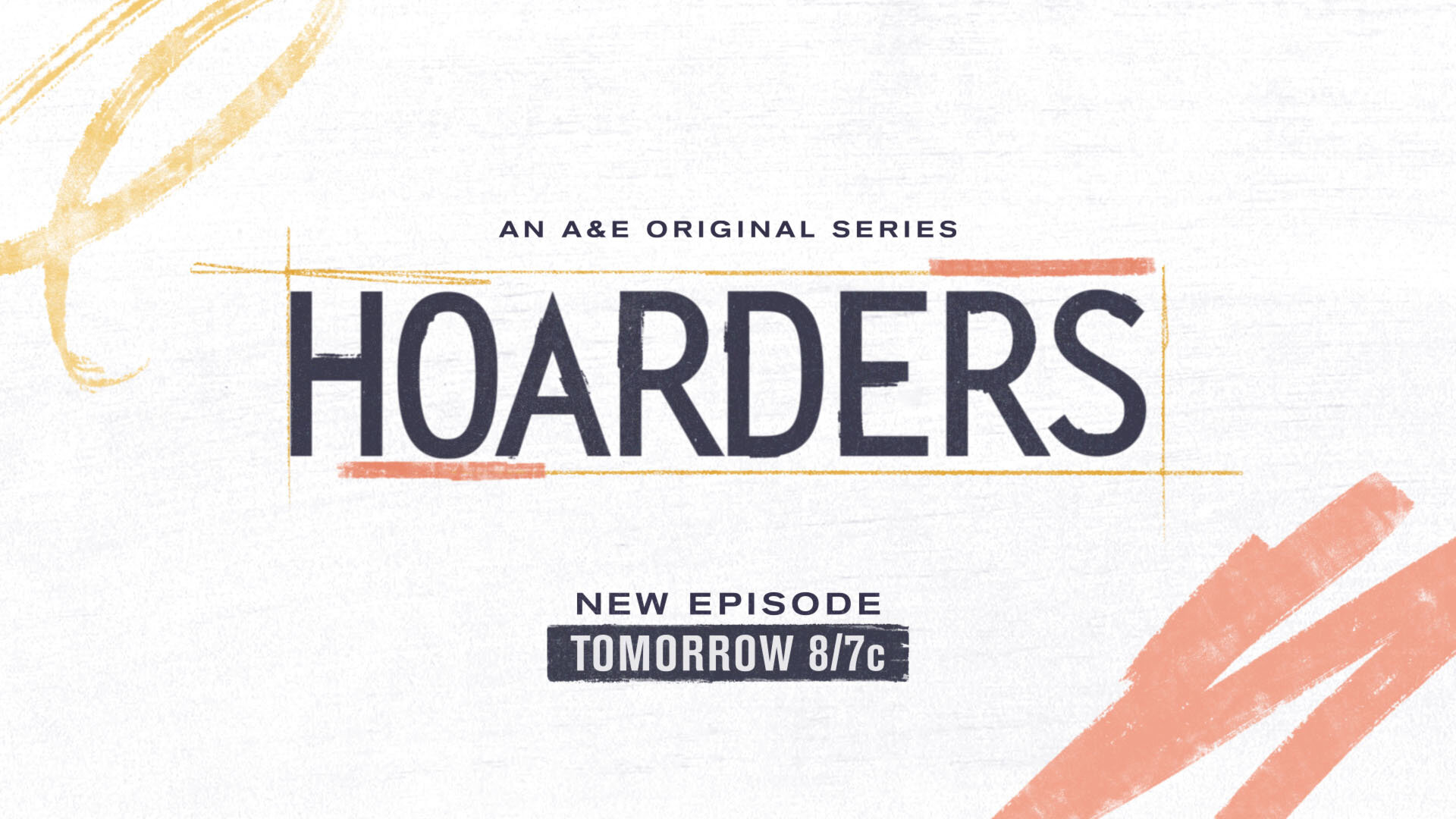
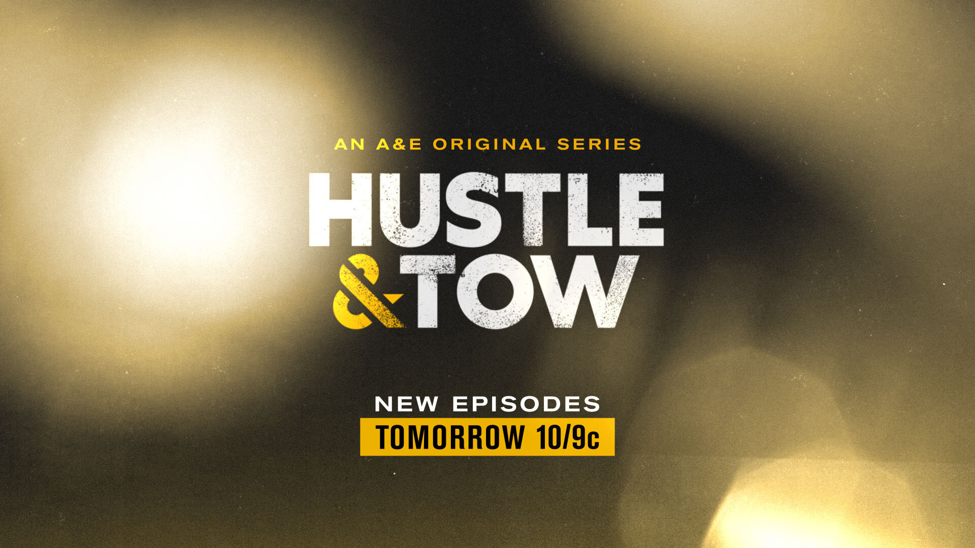
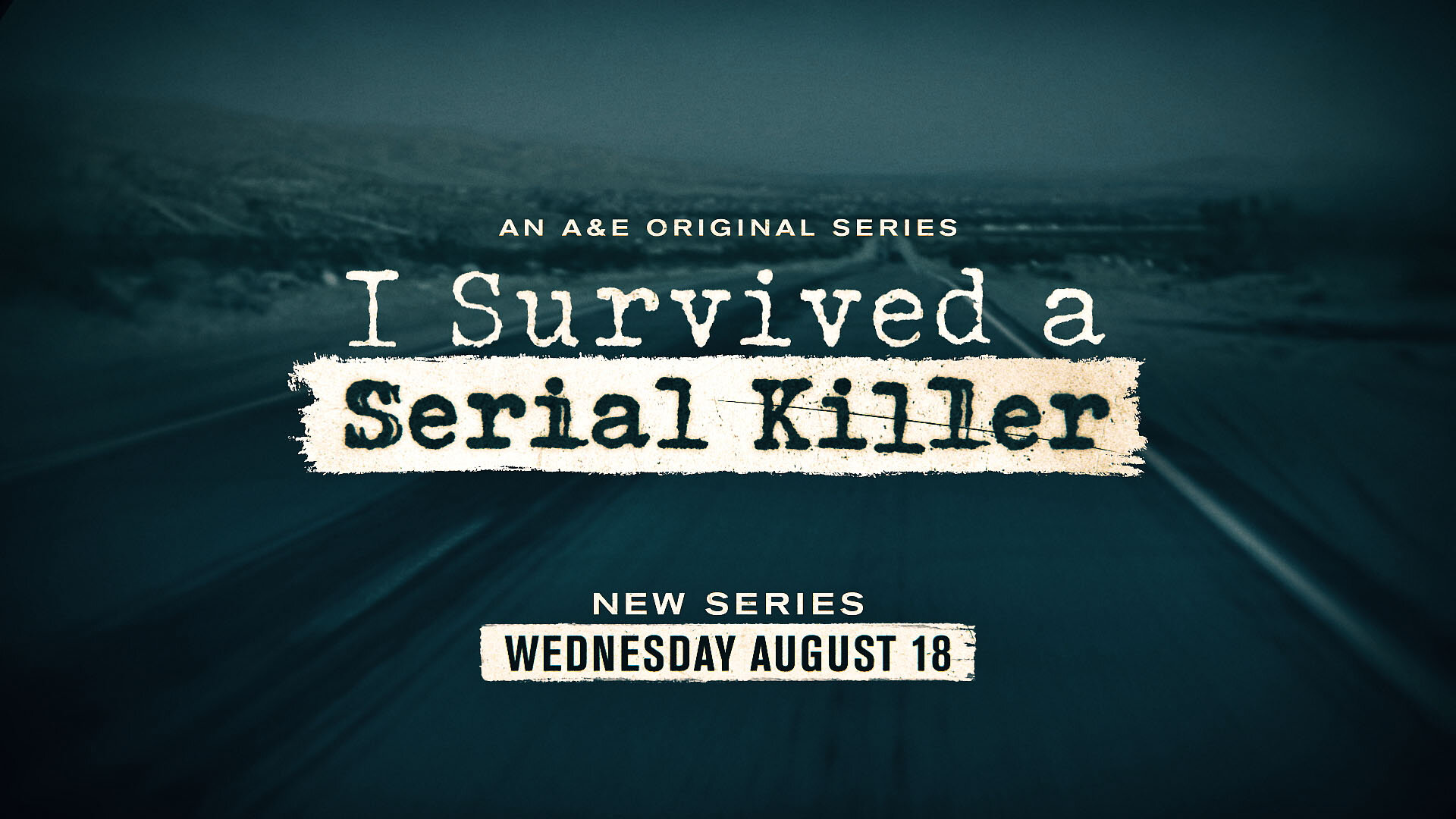
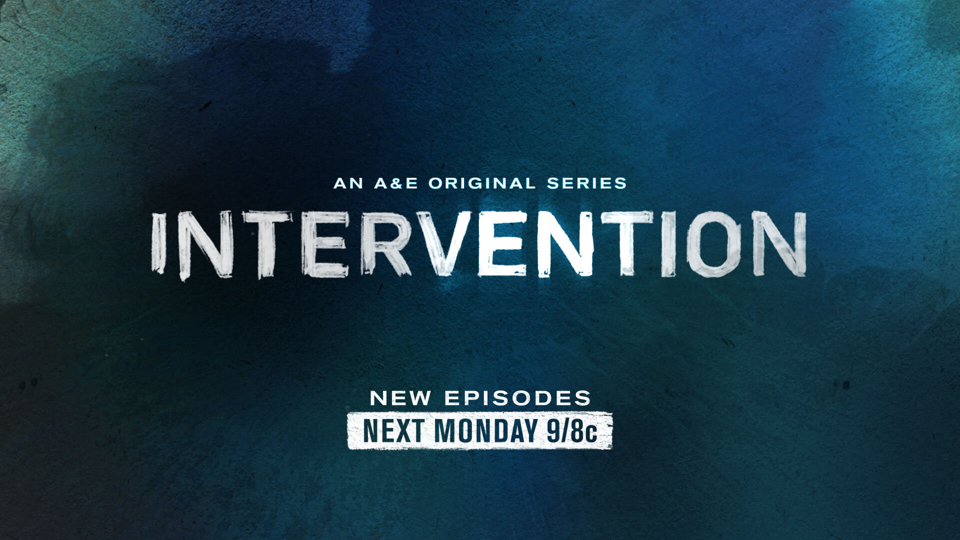
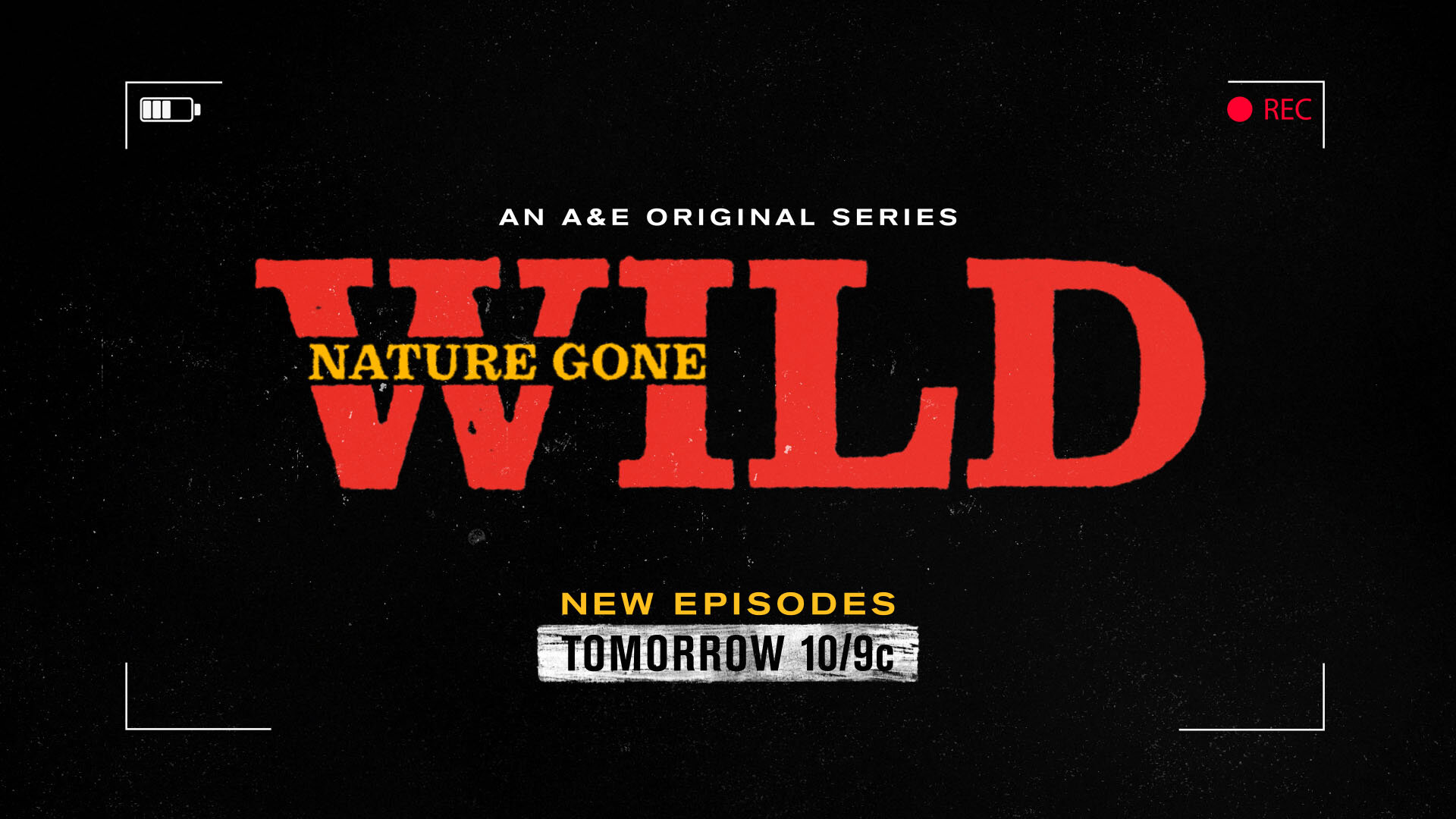
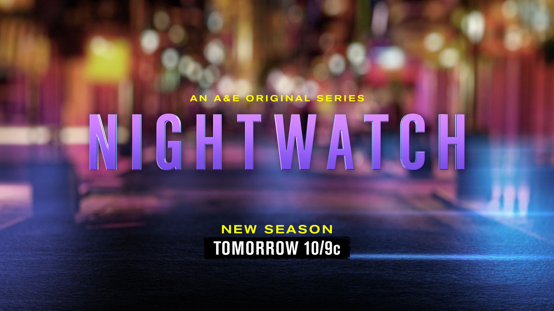
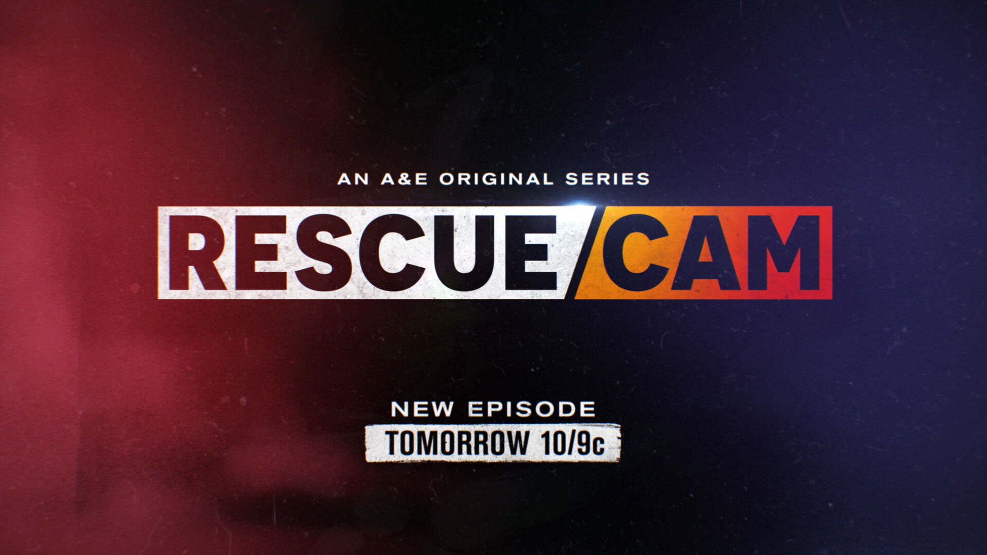
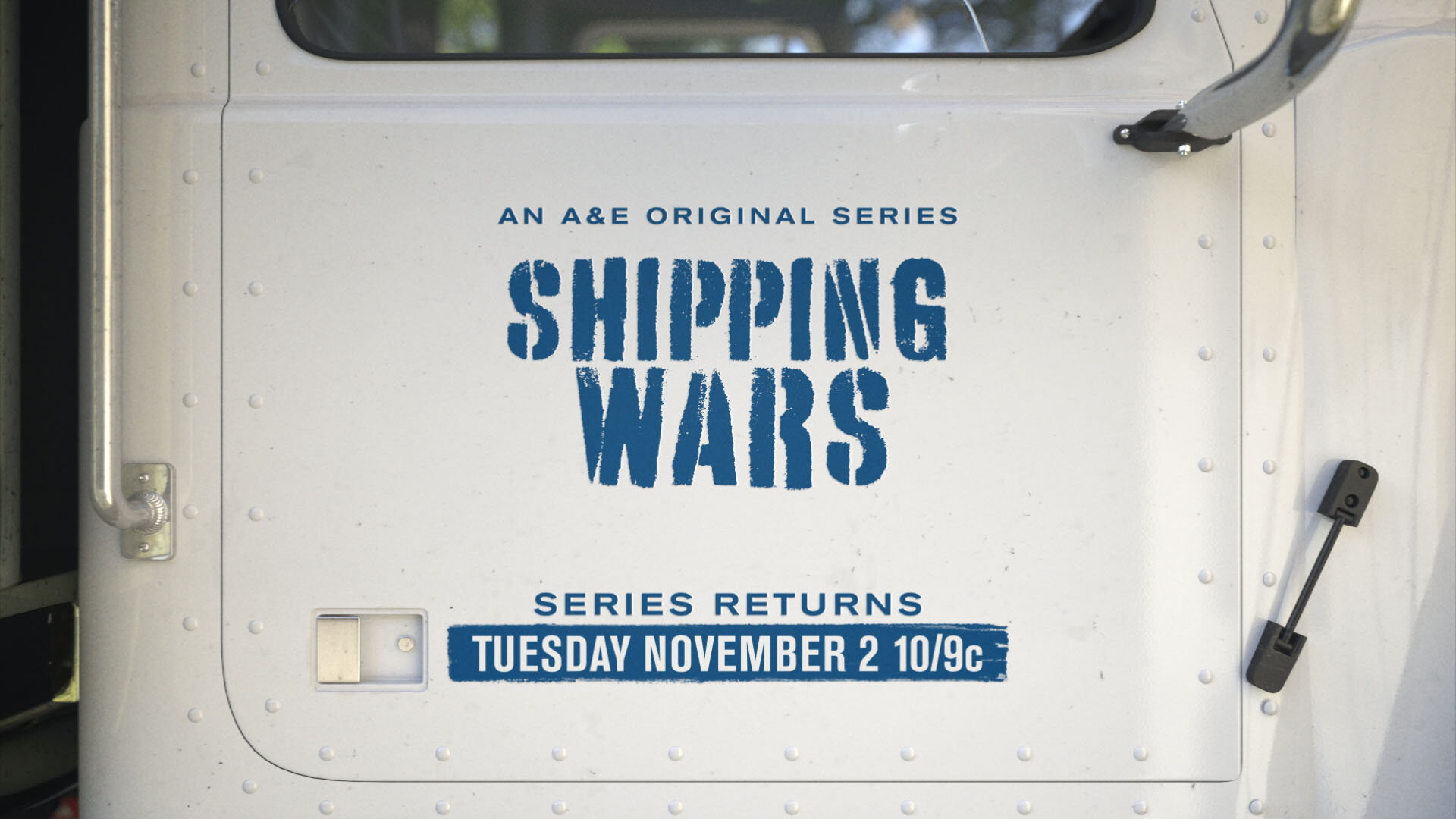
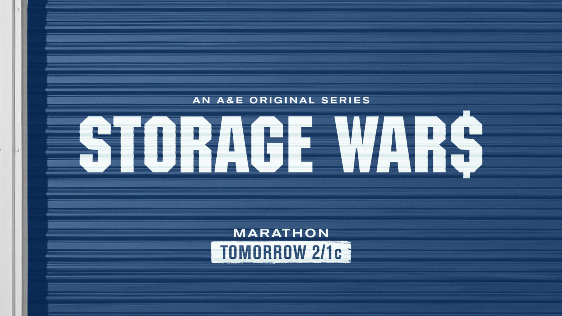
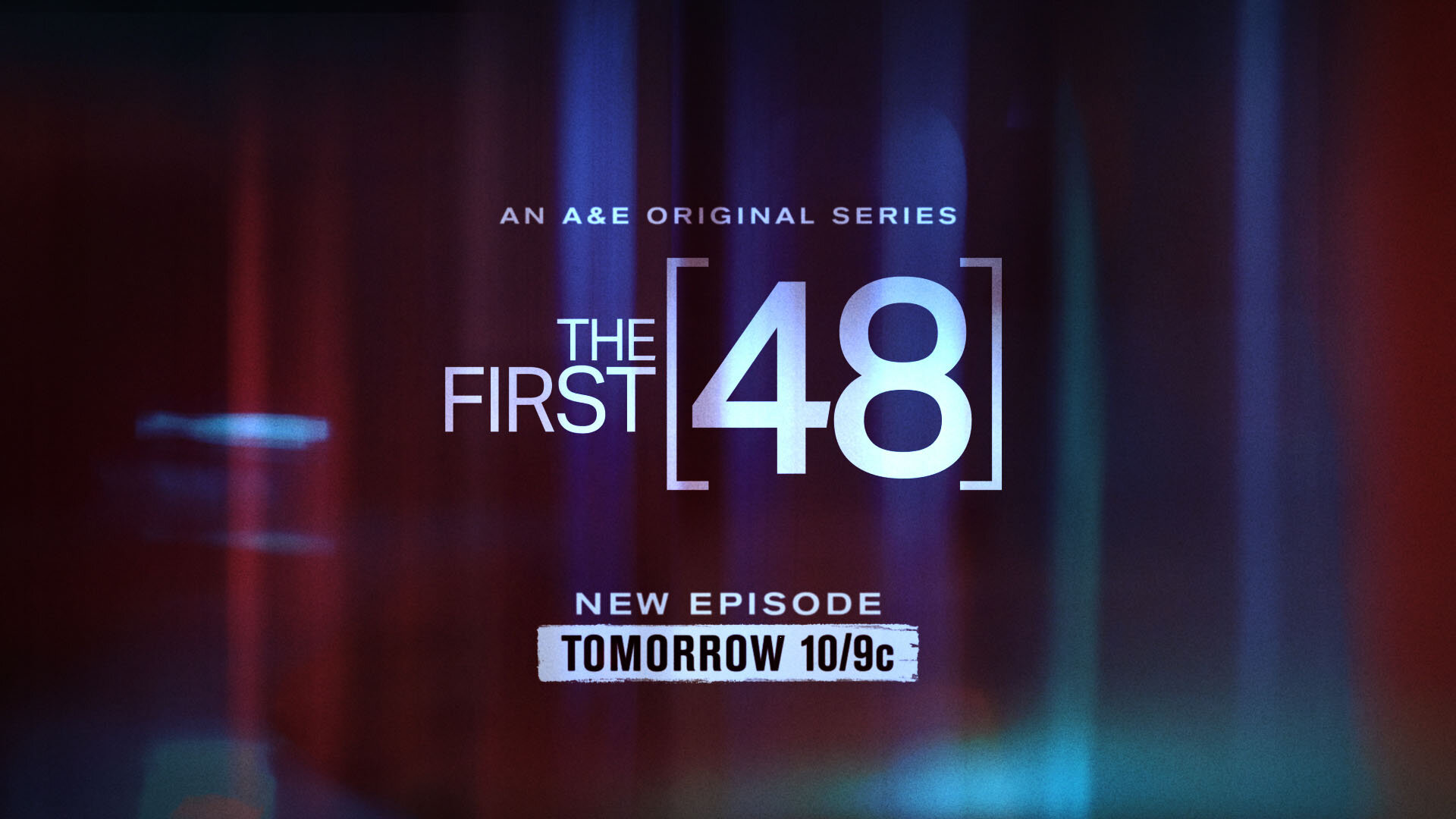
I was asked to review the promo endpage system for A&E’s universe of shows, create a guide that specified rules for the endpage components, and then adjust each toolkit. A&E’s lineup of shows has a broad range of genres, so it was important to offer a visual reminder that anchored them to the A&E family with the consistent placement and size of logos and tune-in typography.
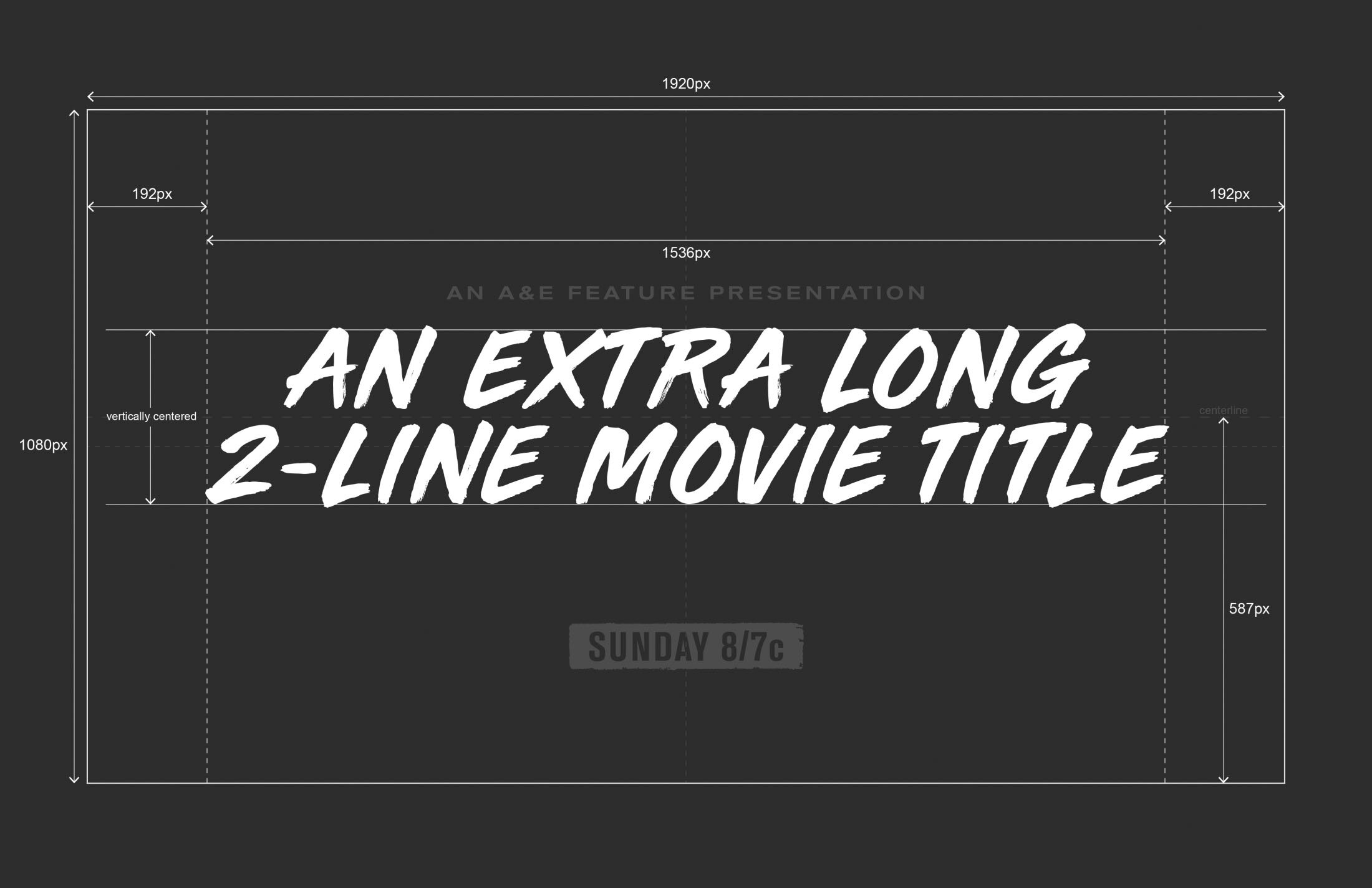
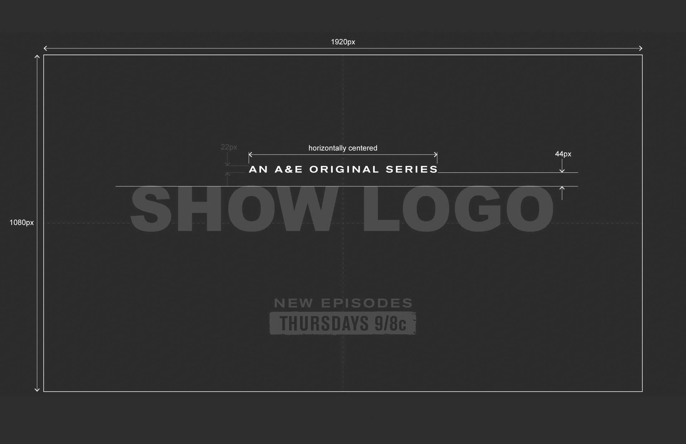
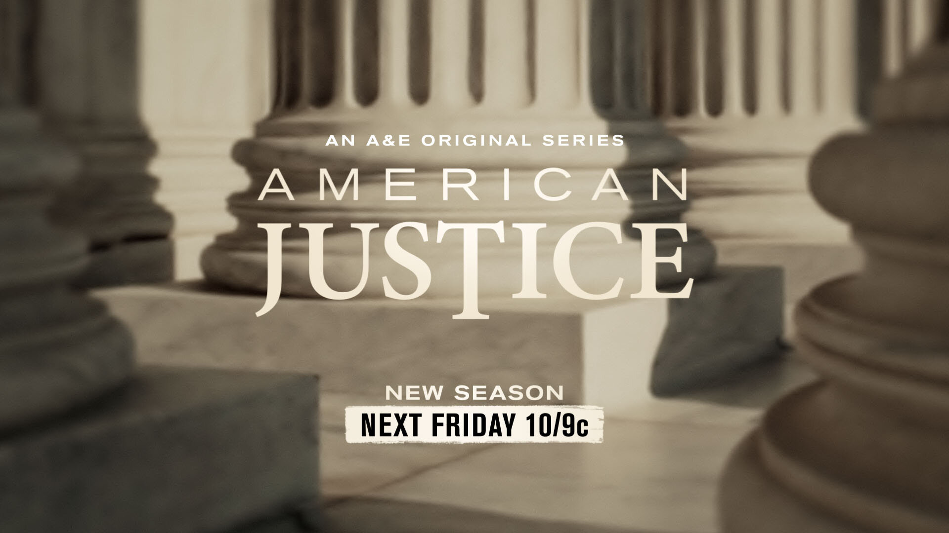
In addition, most programs would now feature the attribution line “An A&E Original Series” to further remind viewers that they were exclusive to the A&E network. Consistently placing this line in such a way that it was visually attached to the show but not distracting was one of many requirements during the refit.


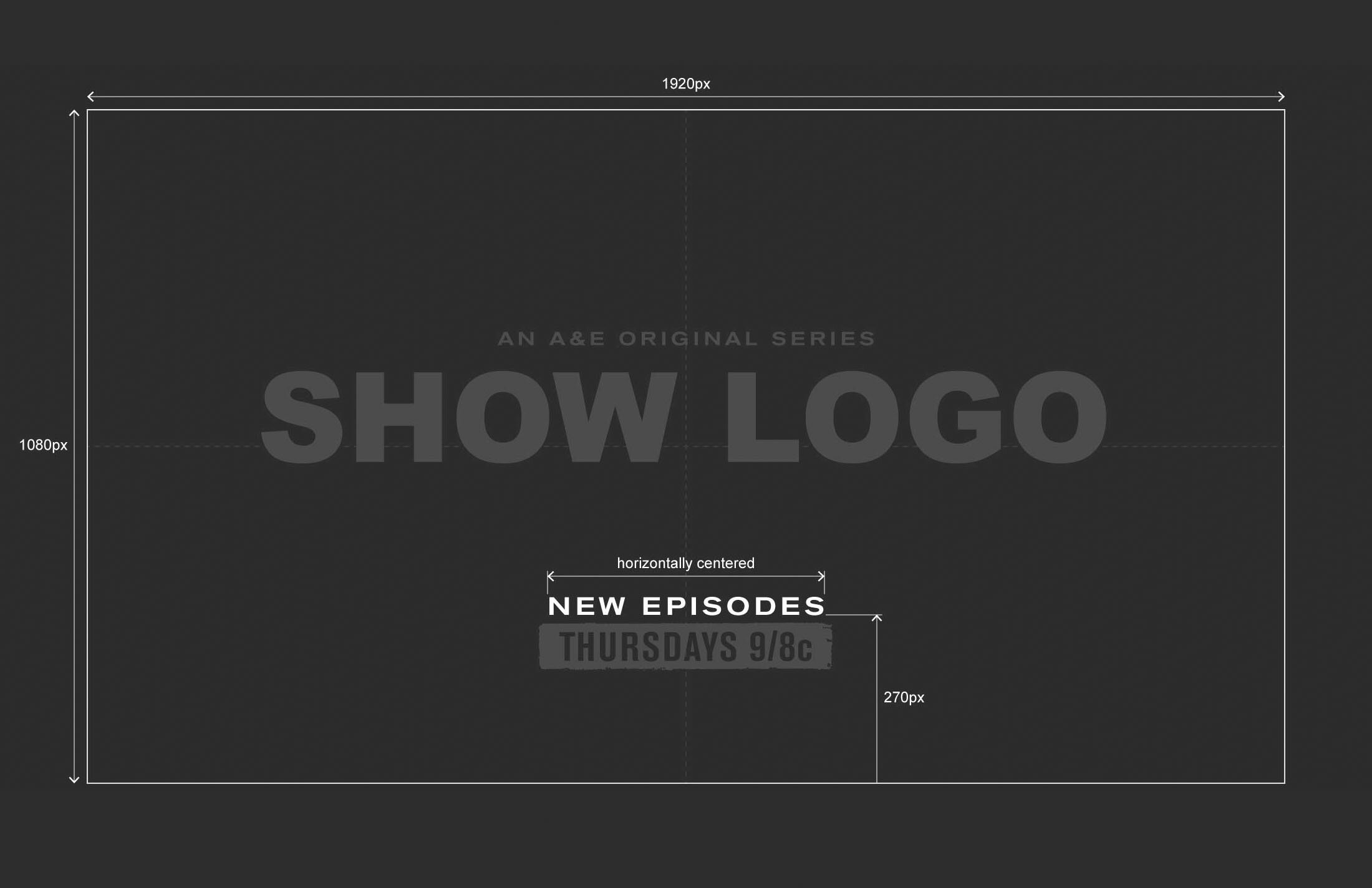
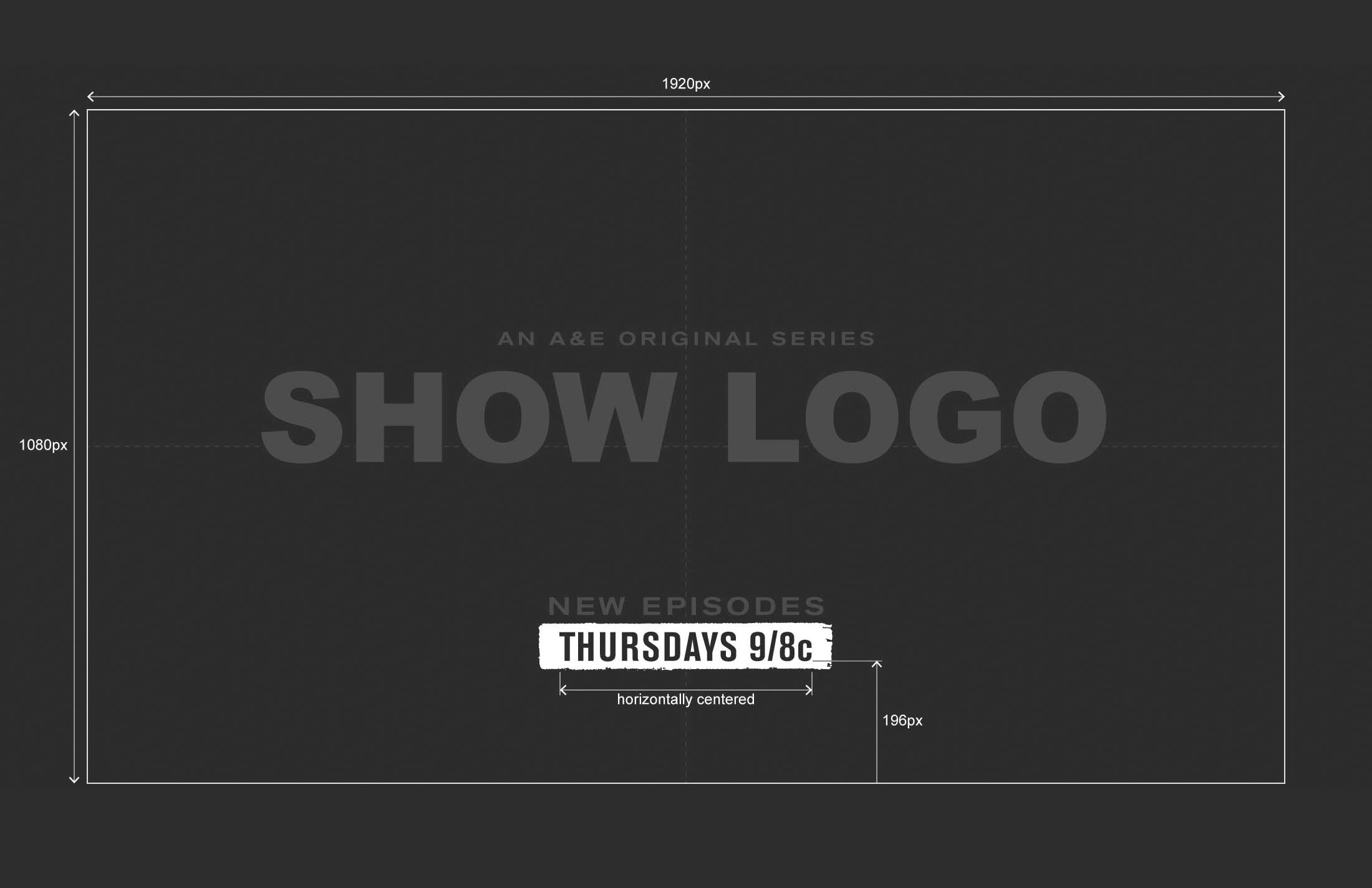
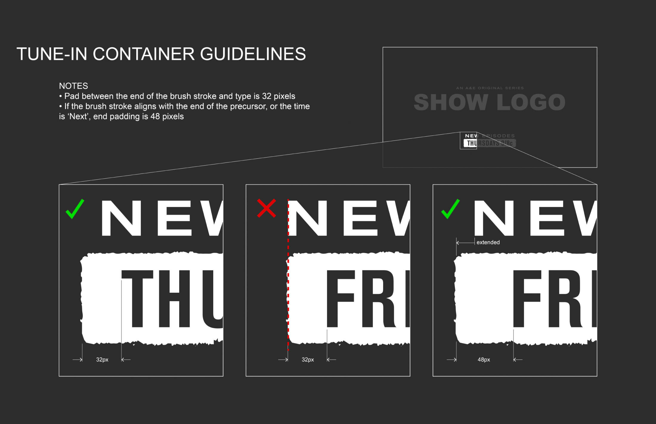
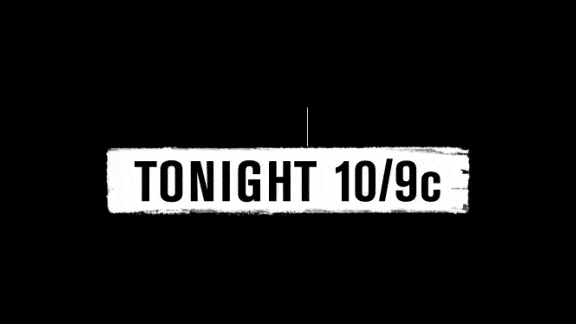
I enjoy making small details like this auto-banner for the textural brush stroke that appears behind the day date and time.
The banner self-adjusts based on the date entered, and includes a setting to prevent the ends of the brush stroke from lining up with the top line of text, temporarily increasing the padding.
A handful of examples showing the before and after results of tweaking the endpages to align with the new toolkit guidelines.
Tune-In Endpages
A&E Logo Buttons
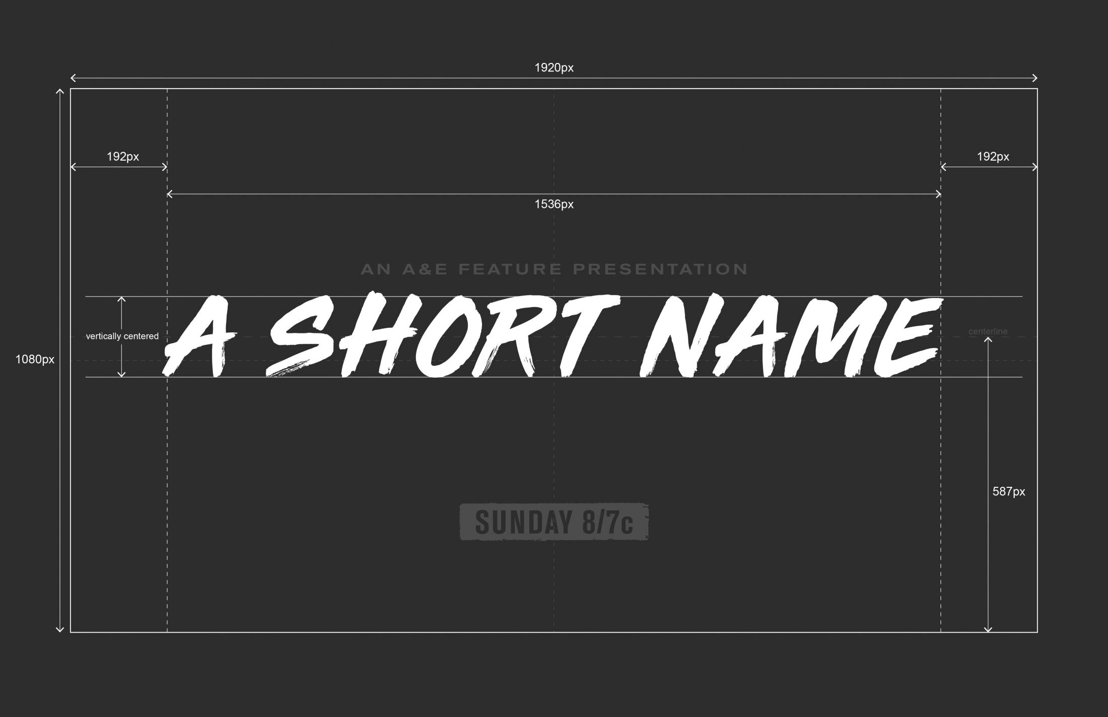
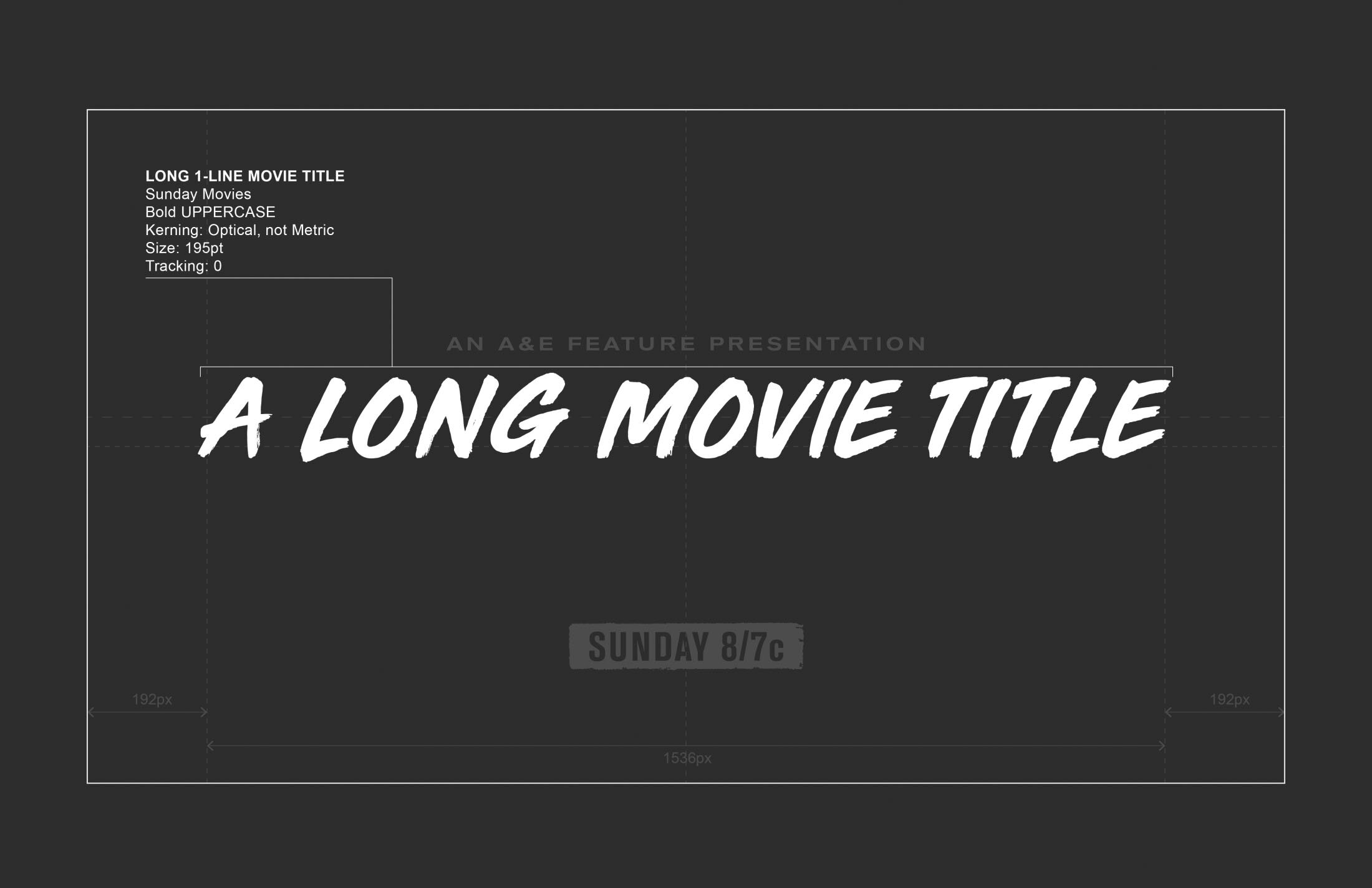
Select Style Guide Frames